


Well-formed eigenfactor
Visualizing information flow in science
How can we map the flow of ideas in science? The Eigenfactor project is a academic research project by the Bergstrom lab in the Department of Biology at the University of Washington. Based on their data, I developed information-aesthetic data visualizations based on citation patterns between scientific journals.
Visualizing the flow of ideas
"well–formed.eigenfactor" presents interactive visualizations to explore emerging patterns in scientific citation networks. The Eigenfactor project calculates a measure of importance for individual journals – the Eigenfactor score – as well as measures of citation flow and a hierarchical clustering based thereon. I turned this information into a set of four information–aesthetic visualizations, each highlighting different aspects of the data.
In visualizations of citation networks, both ball–and-stick–like network representations as well as maps are prevalent. Our project extends the visual vocabulary in this area: on the one hand, by re-purposing existing techniques, such as radial edge bundling and treemaps; on the other hand, by inventing novel approaches like “magnetic pins” as flow indicators and an “alluvial” diagram to represent change over time in cluster structure.
The visualizations feature four different perspectives on the data:
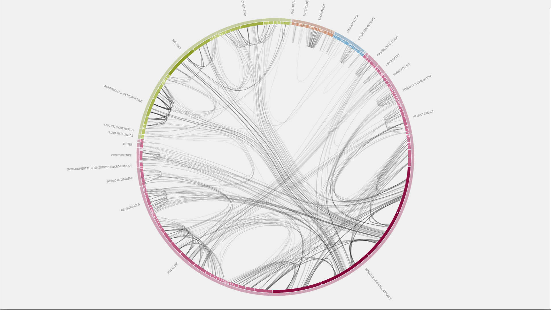
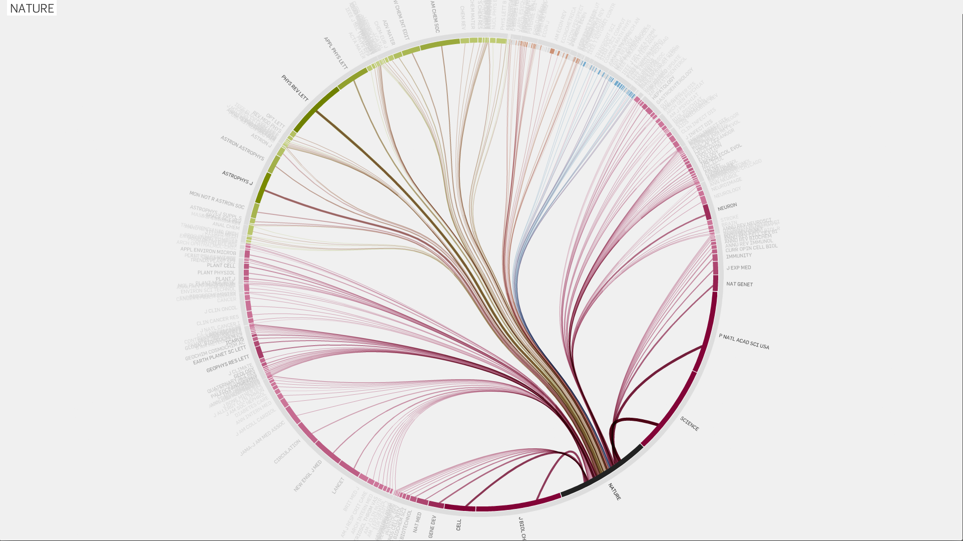
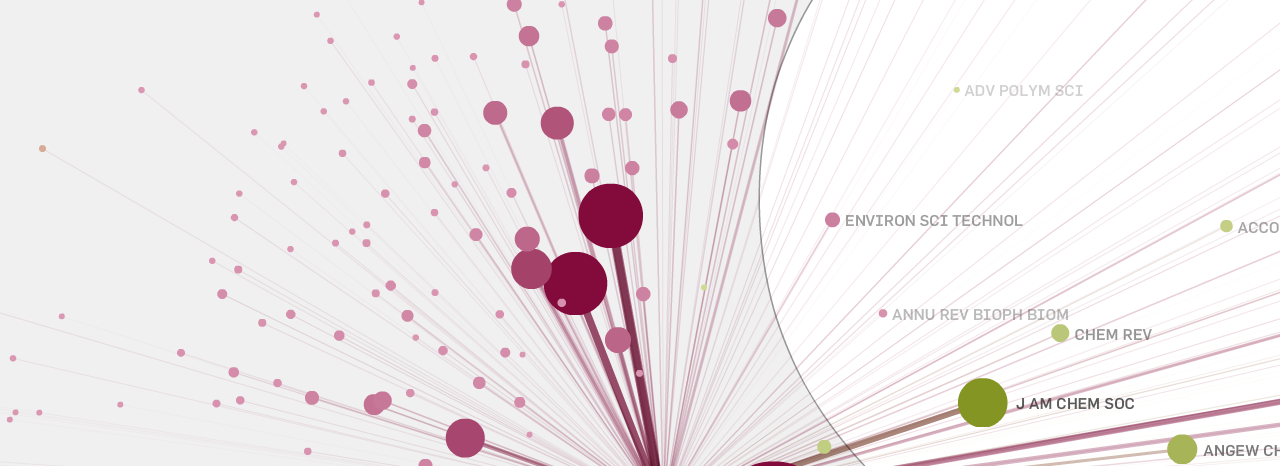
Citation patterns
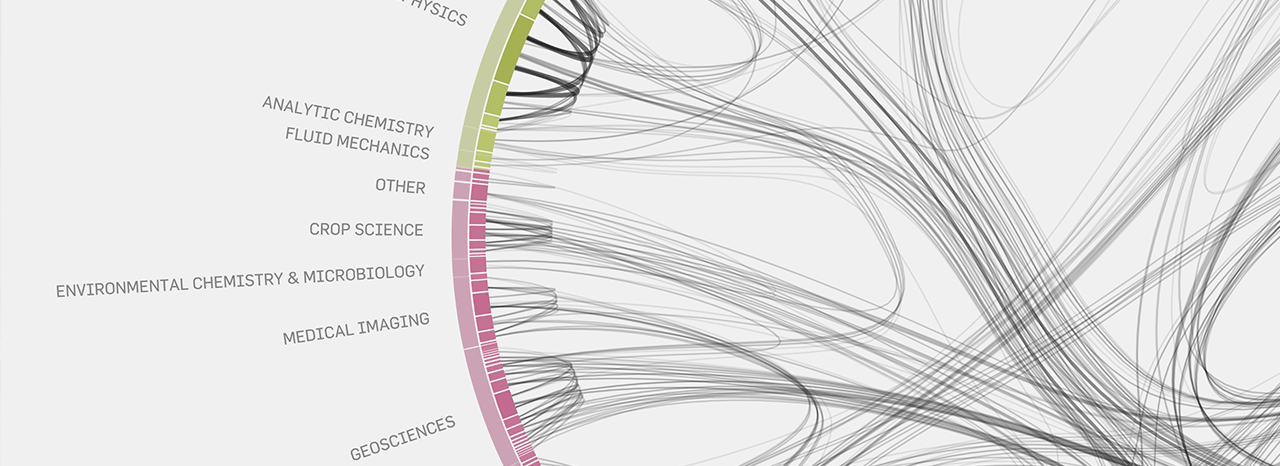
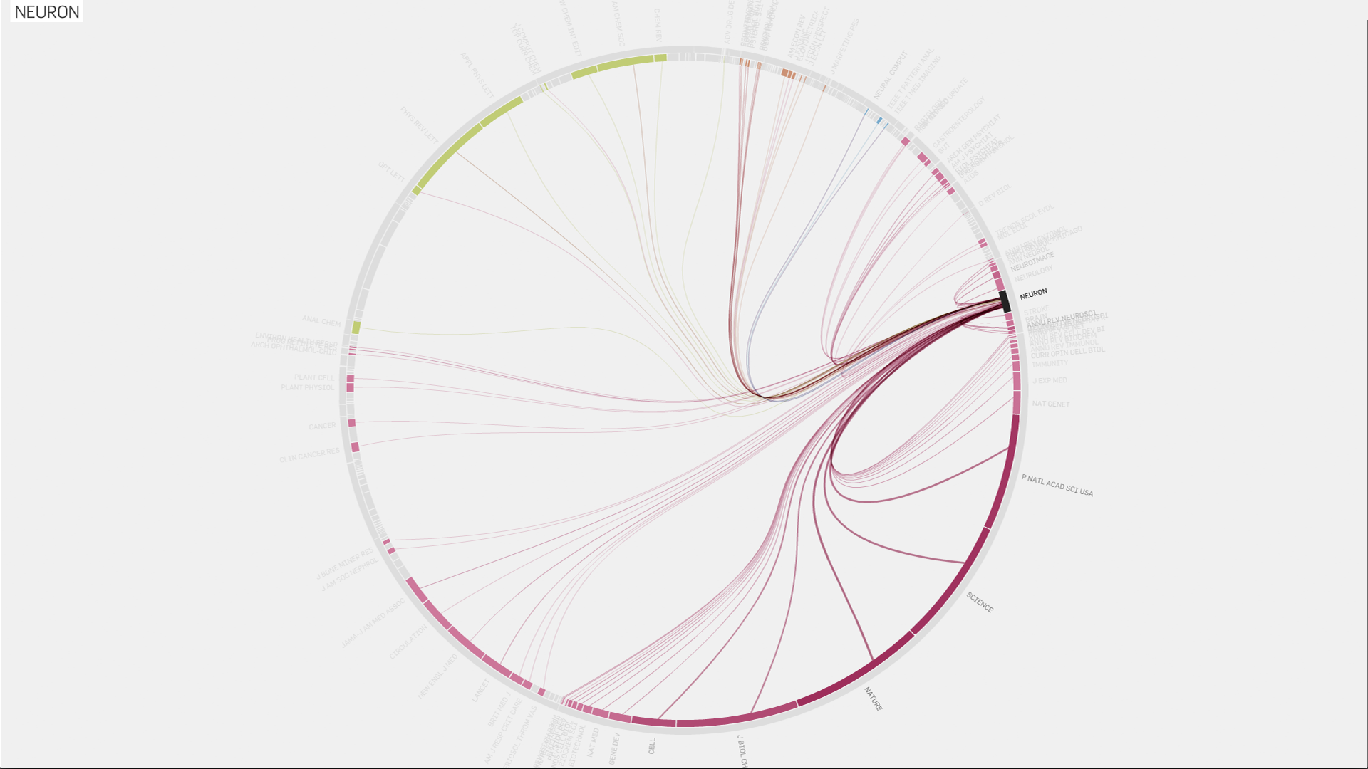
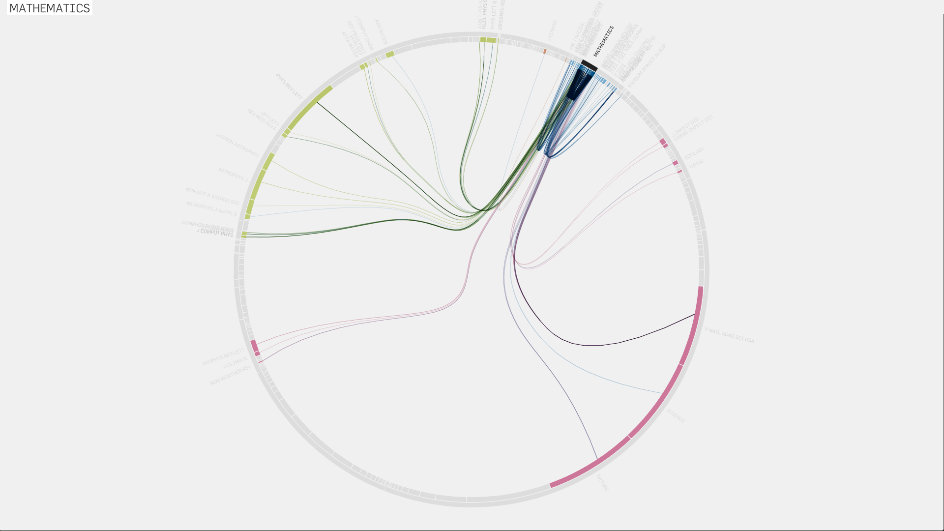
This radial diagram gives an overview of the citation network. The colors mark large groups of journals, further subdivided into fields in the outer ring; segments of the inner ring represent the journals, scaled by Eigenfactor Score. The citation links follow the cluster structure, using the hierarchical edge bundling technique.
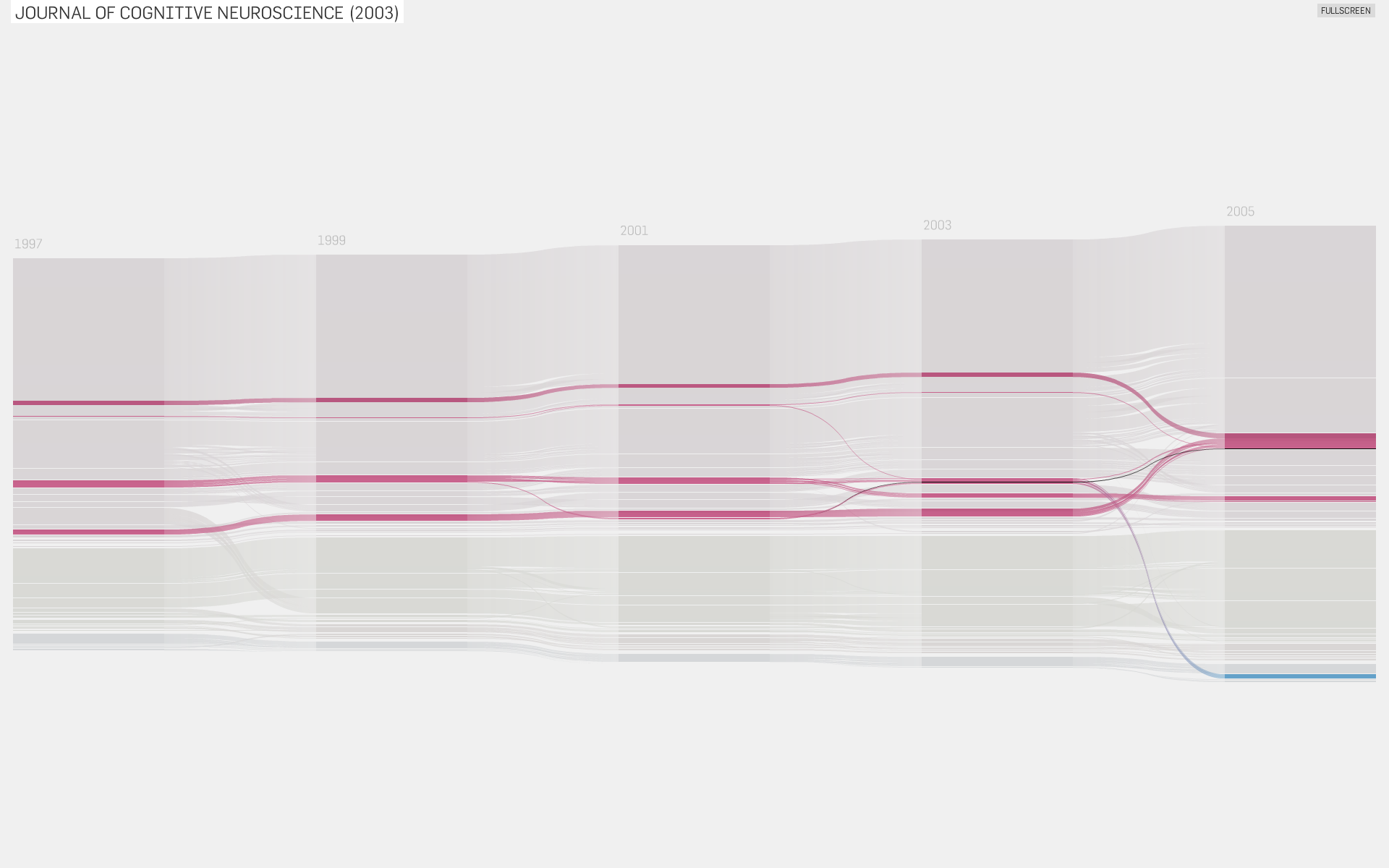
Change over time:
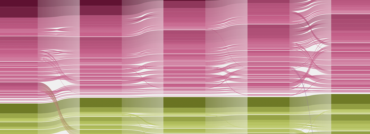
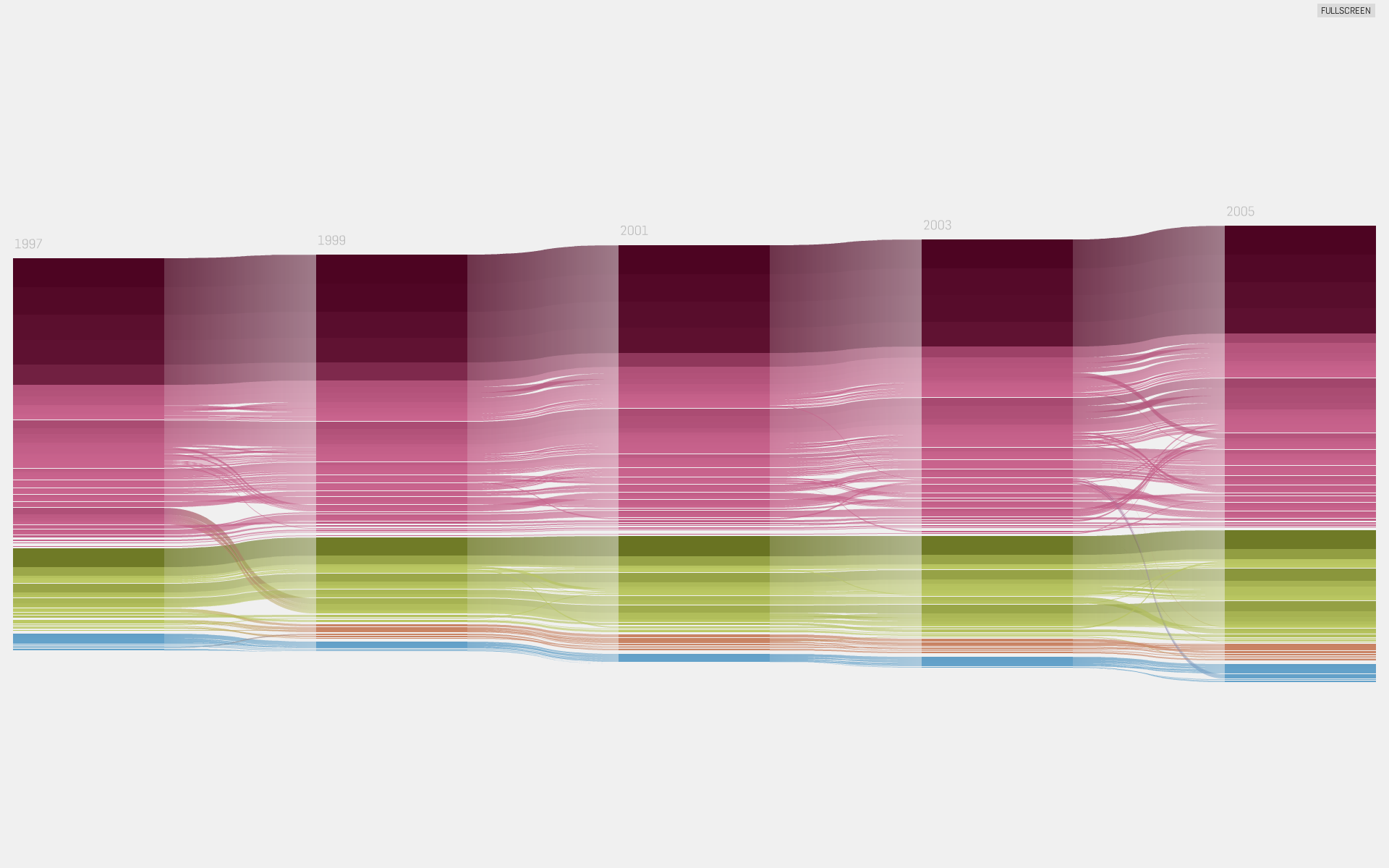
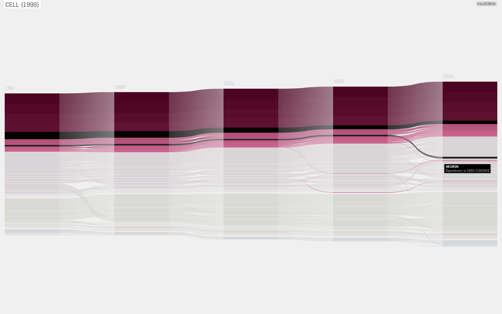
This “alluvial” diagram displays changes in Eigenfactor score and clustering over time. The journals are grouped vertically by their cluster structure and horizontally by year. Bars belonging to the same journal are connected. Clicking highlights a journal over the years, and all clusters it has been part of, to track changes of influence and cluster structure.
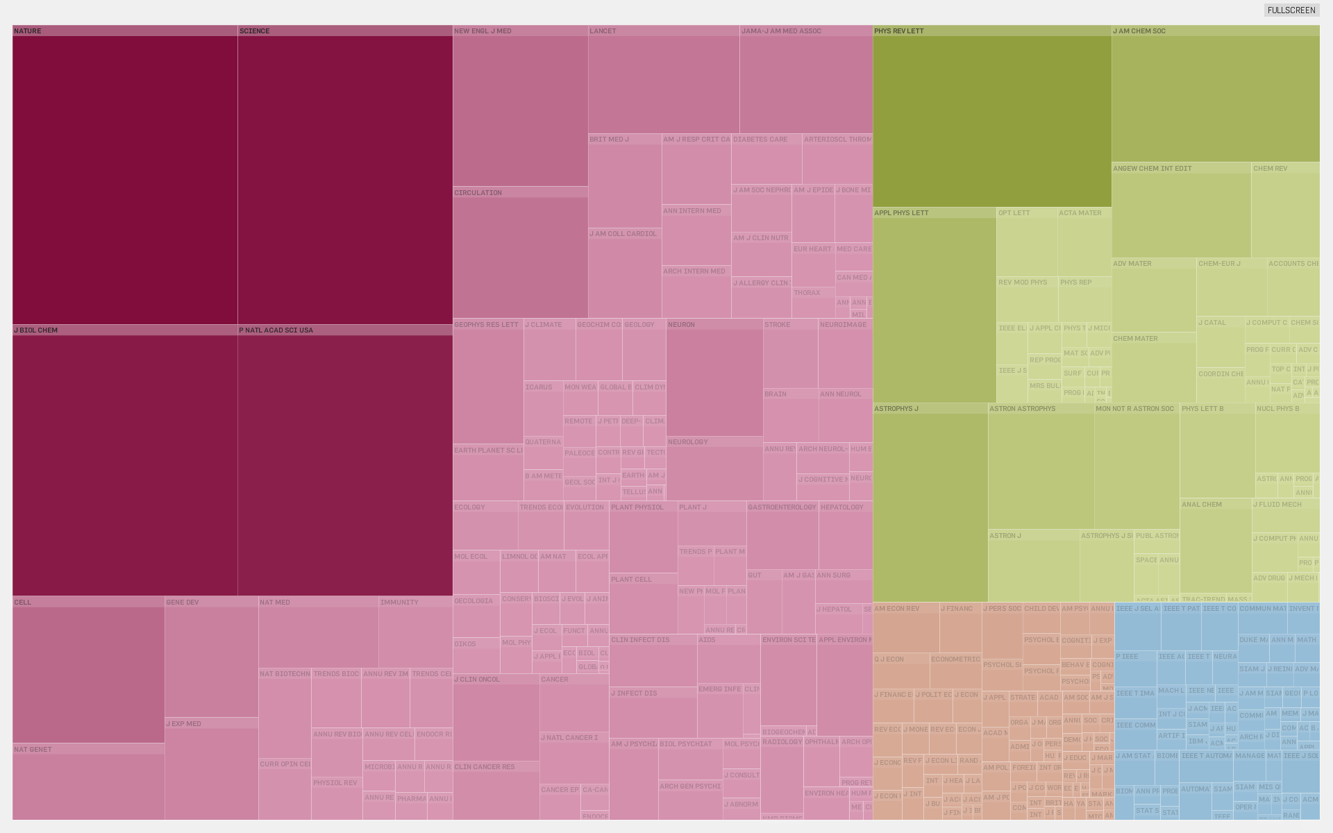
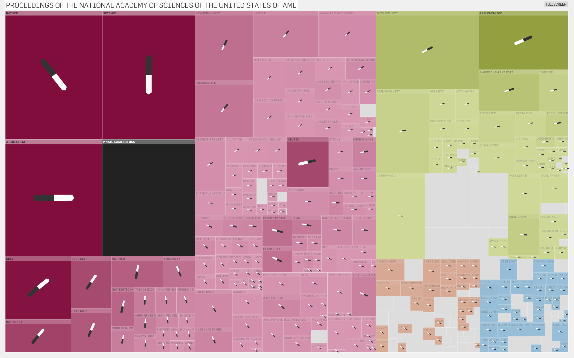
Clustering
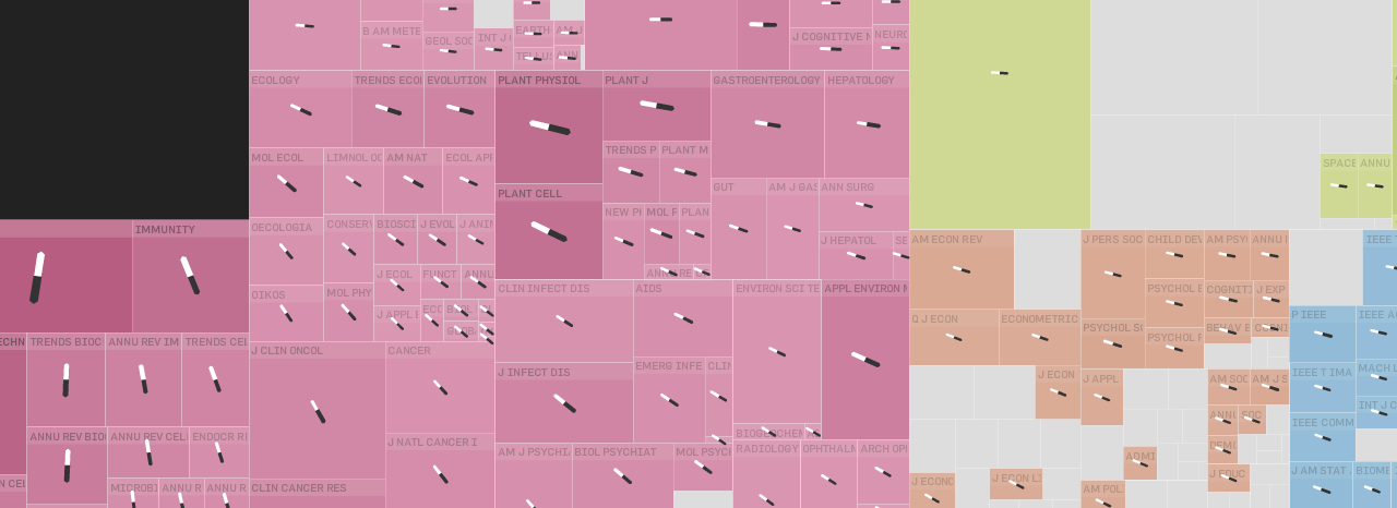
Based on the squarified treemap layout algorithm, this visualization features “magnetic pins” to indicate both incoming and outgoing citation
flow for any selected journal. The size of square corresponds to the Eigenfactor score of the corresponding journal.
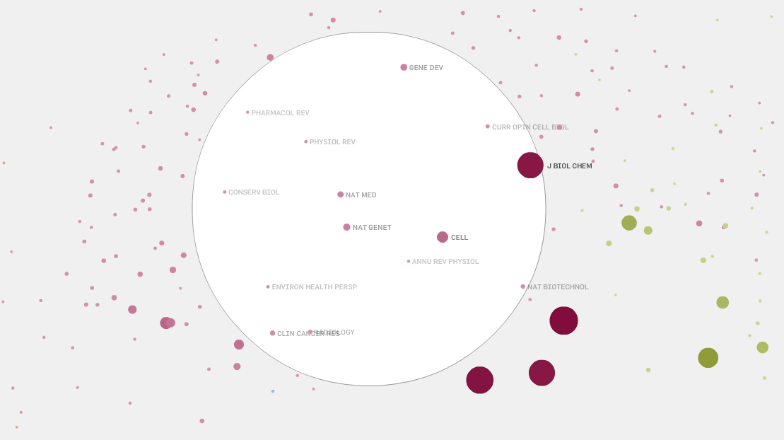
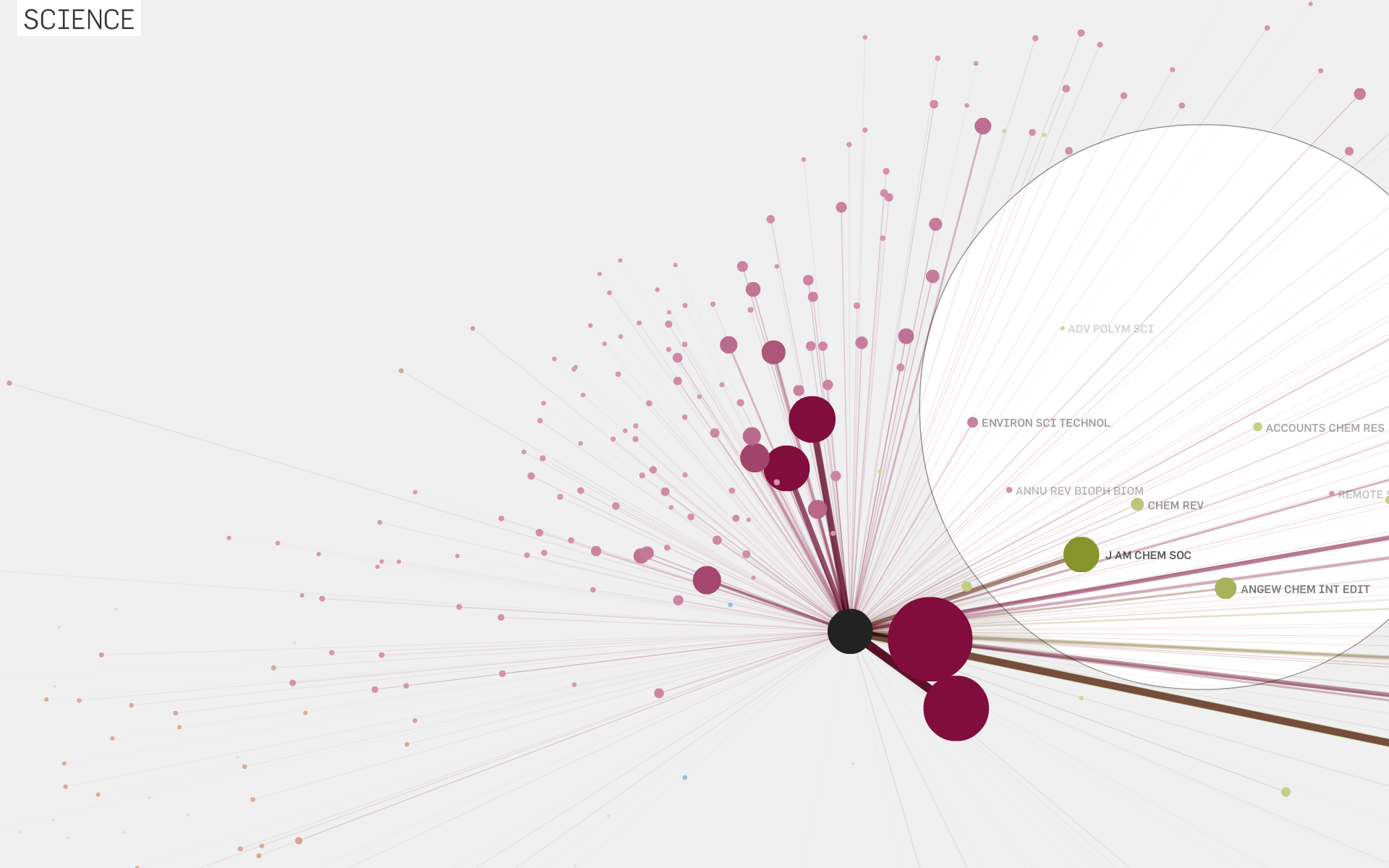
Map
This map visualization puts journals, which frequently cite each other, closer together. You can drag the white magnification lens around to enlarge a part of the map for closer inspection. Clicking one of the nodes will highlight all its citation connections.
Data
We use a subset of the citation data from Thomson Reuters' Journal Citation Reports 1997–2005. For the visualizations, 400 journals with their ca. 13’000 citation edges were selected, ensuring a coverage of the top journals in each field.