Elastic lists allow to navigate large, multi-dimensional info spaces with just a few clicks, never letting you run into situations with zero results. They enhance traditional UI approaches for facet browsers by visualizing weight proportions, animated transitions, emphasis of characteristic values and sparkline visualizations.


Background: Facet Browsing
Facet browsers make different aspects of the underlying data accessible in parallel. Selecting one of the metadata values, and thus filtering the result set, restricts the available metadata values only to those occurring in the results. Consequently, the user is visually guided through an iterative process of query refinement and expansion, never encountering situations with zero results.

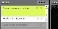
Facet browsing applications impose no restrictions, in which order, or in which granularity filters are applied on a result set. This equal treatment of multiple dimensions differs from, e.g. typical web site structures or file systems, where a single taxonomy is the pre–dominant organization principle, and other metadata are only supplements for sorting or filtering. Additionally, it is a common pattern to visualize the number of occurrences of a concept in the given focus. The simplest and most common option here is to provide it in brackets after the concept label (e.g. “Europe (5)”).
Elastic Lists
Elastic lists the navigation principle of facetted browsing, but enhance the information presentation with respect to the following features:
Visualize weight proportions
In many situations, it is informative to immediately see which are the predominant values and which cover only a minor part of the data set.In the example above, you can see immediately that more men than women have won peace nobel prizes.
Emphasize characteristic values
In order to understand what makes a data set special compared to the whole collection, it is helpful to indicate how the displayed proportions differ from the global distribution.Back to the example: While more men than women have won the peace nobel prize, the number of female winners is still much higher than compared to the global (unfiltered) distribution. Accordingly, the value is presented brighter to indicate the value is higher than expected in the current filtering context.
Animated transitions
Transitions are animated smoothly and even filtered–out attribute values are still visible as flat lines. This makes the filtering process transparent to the user and allow easy localisation of the local metadata profile compared to the global profile.
